New design of the system interface
Dear friends, our dedicated team continues updating the CleverStaff recruitment tracking software interface appearance. The long-expected improvements are already here!
The user interface looks crisp and classy now. We have also changed some details in it to make your work in the system more convenient and effective.
CleverStaff interface before the change:

And after the change:
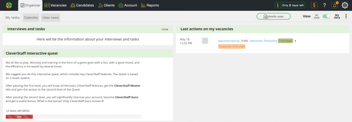
Notice that the “Invite user” button has changed its place:

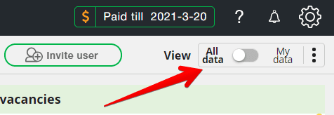
Besides, we have relocated the “View” button to make switching the visibility modes of the account more handy:
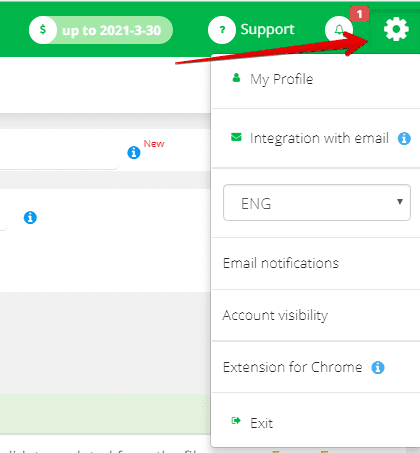
The interface settings menu has been changed too. It had such appearance prior the update:
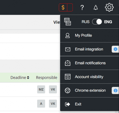
Currently, the menu looks this way:
We didn’t forget to update the mobile version of CS interface making its usability better as well.
The mobile version of CleverStaff before the change:
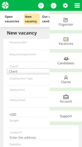
And after the change:
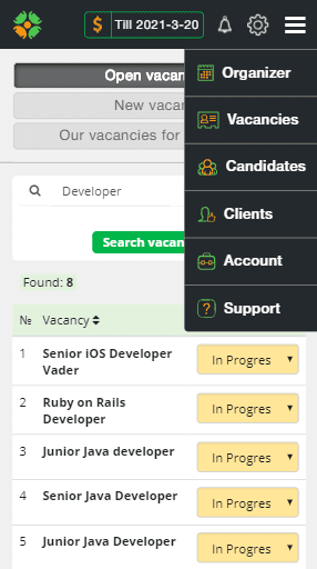
Pretty elegant, don’t you think?
The further the better 😉
Your friends @CleverStaff