New version: improving the UI and the UX of CleverStaff interface.
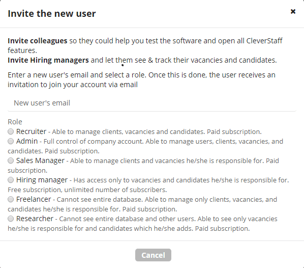
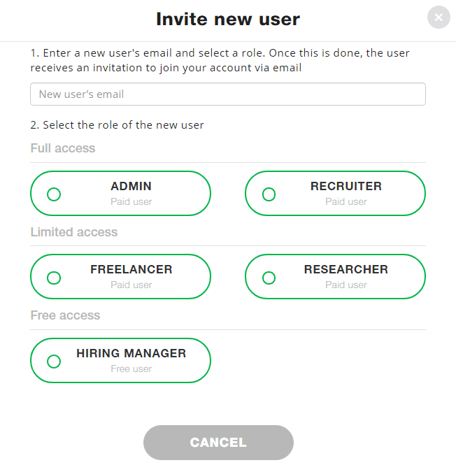
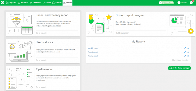
Dear friends, our team have started to improve the convenience and beauty of the interface. We have redesigned the appearance of the invitation window for new users and the “Reports” tab.
Earlier this page looked like this:
 Now it looks like this:
 Earlier the ‘Report’ tab looked like this:
 Appearance after the changes:
 Your friends from CleverStaff
Level-up your recruitment with CleverStaff