What does the updated CleverStaff look like: what exactly has changed?
Dear friends, we would like to remind you that our team is currently actively working on updating the internal interface – we want to make it more visually pleasing and more convenient to use.
A few days ago, we promised to show you what the updated, “dressed up” CleverStaff will look like ☺ This time has come. We have prepared a few screenshots to explain what we have changed and why.
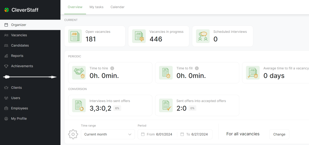
- Section navigation. We have moved the section navigation from the top to the left to help you make better use of the first screen and see as much information as possible. For example, this is how the Metrics Overview now looks like.
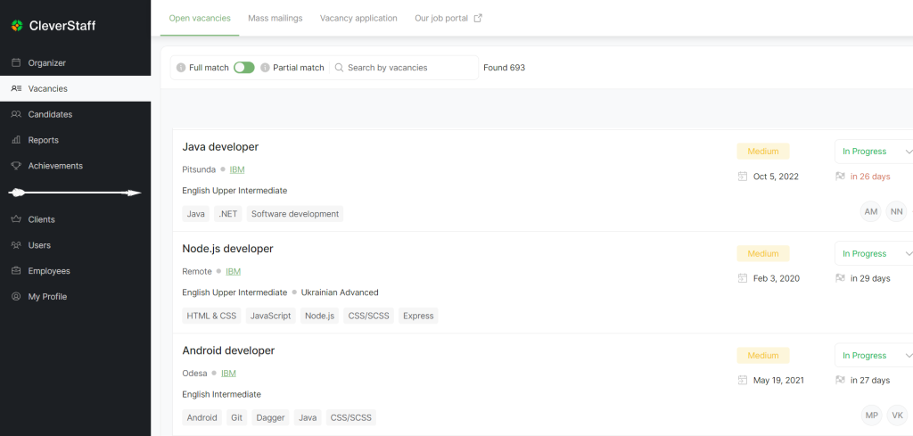
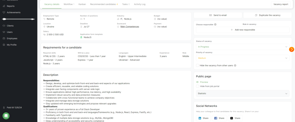
- A new look for vacancies. From now on, vacancies are presented in the format of individual cards. However, the previous format – in the form of a list – remains. Note that skill and language are additionally displayed if they are specified in the vacancy requirements. Also, those responsible for the vacancy are recorded here. At the same time, the user can switch between the table and cards at any time.
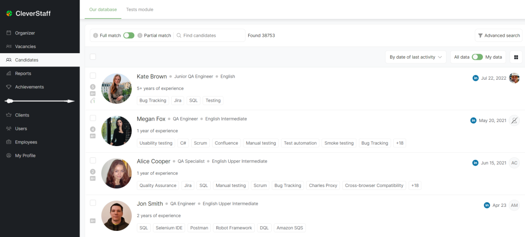
- An alternative view of Candidates. In the updated interface, Candidates also looks different and more interesting. As in the case of vacancies, you can still view candidates in a list format. We have also added a display of skill, language, and general experience.
You will be able to see the updated design of the CleverStaff system in July. Personally, we are looking forward to this event 🙂
Level-up your recruitment with CleverStaff